graphic artistry
graphic artistry
graphic artistry
graphic artistry
graphic artistry
graphic artistry
Eron Za
y
manangan
graphic designer
graphic artistry
graphic artistry
graphic artistry
About Me
2017
2019
to present
Learning the Basics
Began my journey into graphic design as a student-journalist, learning the fundamentals of Photoshop.
As a graphic designer, I firmly believe in the principle that less is more. My approach to design is rooted in simplicity and effectiveness, ensuring that each element serves a clear purpose and contributes to the overall message. In every project, I combine these principles to deliver designs that are simple yet powerful, visually appealing yet functional, and always in harmony with the client's vision. This design philosophy guides me in creating impactful graphics that leave a lasting impression.
2019
Entering the Market
Transitioned from learning to earning by designing product labels for local businesses, marking my entry into the commercial market.
Expanding Horizons
Expanded my expertise by designing brand logos, marketing and event posters, infographics, and publication materials, delivering diverse and impactful designs.
my services
1
Brand Identity
Design
2
Marketing Materials
- Product Labels : Designing attractive and effective product labels.
- Posters : Designing striking posters for events and promotions.
- Social Media Graphics : Crafting visuals for social media campaigns.
3
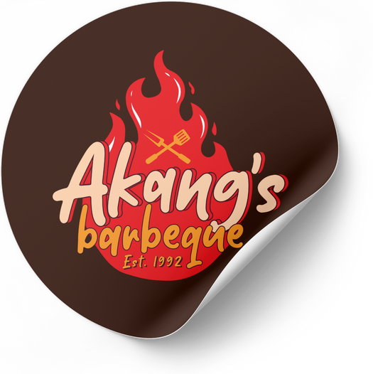
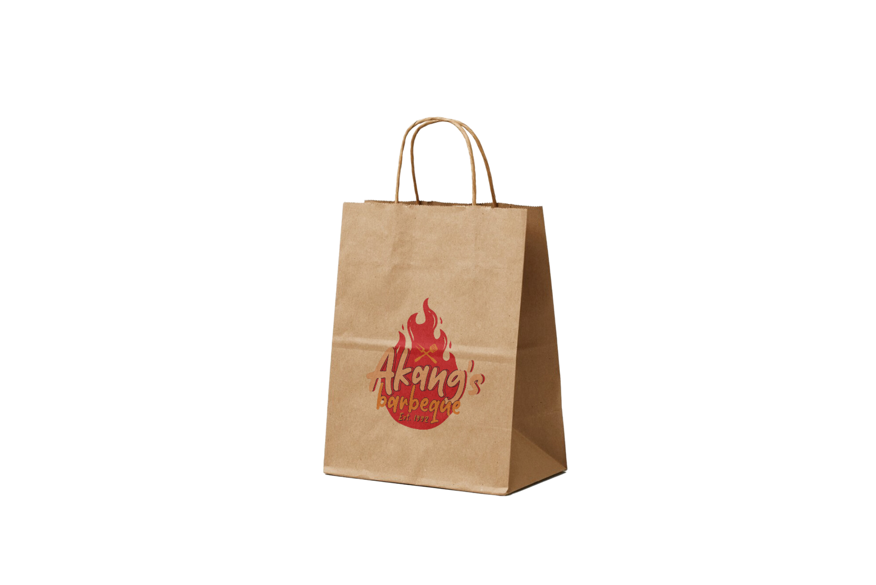
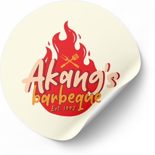
- Brand Logos : Crafting unique and memorable logos.
- Brand Guidelines : Creating comprehensive brand style guides.
- Stationery Design : Designing business cards, letterheads, envelopes, and other branded materials.
Visual Content Creation
- Infographics : Designing informative and visually appealing infographics.
- Canva Templates : Creating customizable Canva templates for various needs.
- Print Designs : Designing print-ready materials such as invitations and banners.
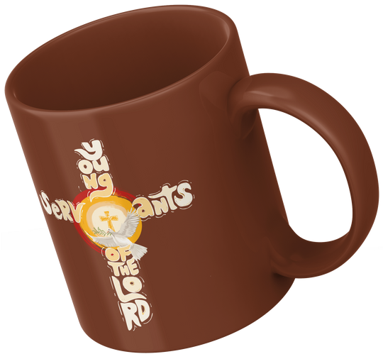
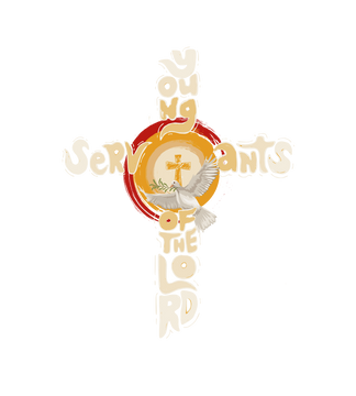
work samples
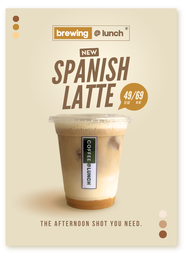
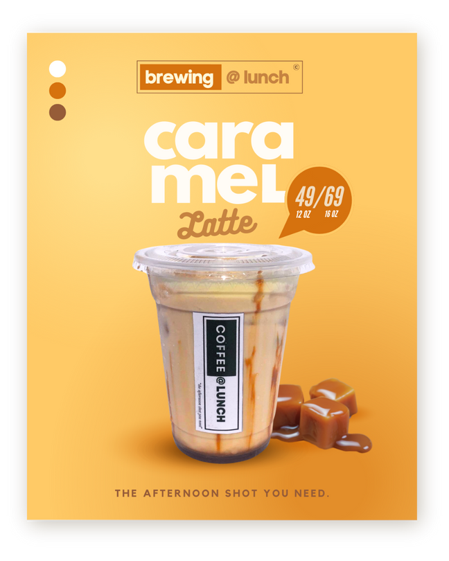
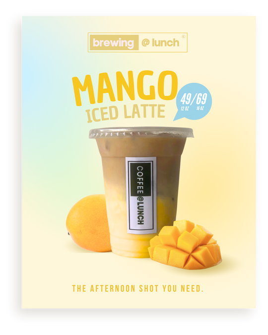
Welcome to my Work Samples section! Here, you'll find a selection of my designs, showcasing my experience in brand identity, marketing materials, and visual content creation. Each piece reflects my commitment to simplicity and effectiveness. I hope you enjoy exploring these examples and seeing how I bring creative visions to life.
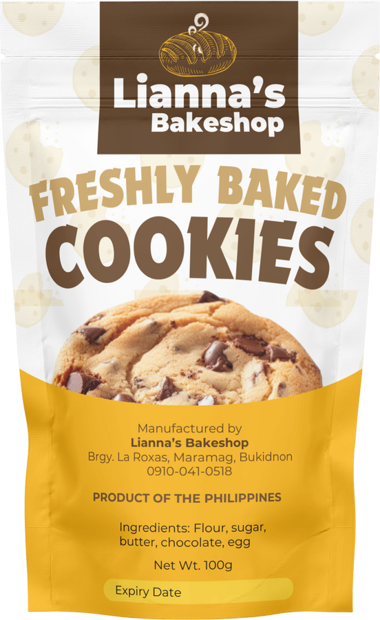
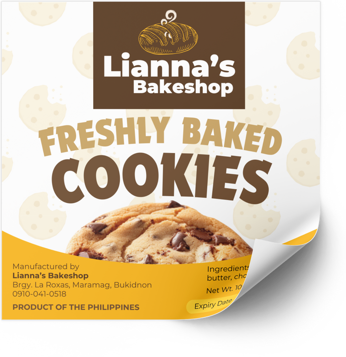
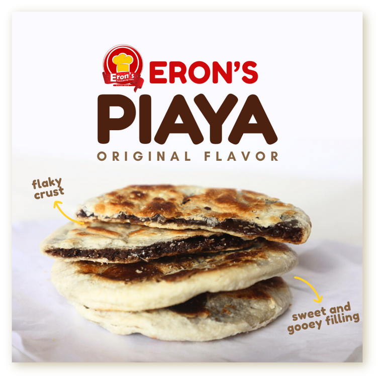
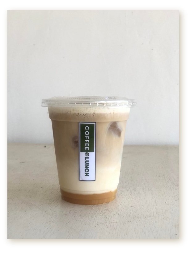
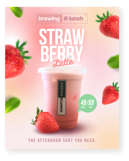
The design process involved enhancing the visual appeal, emphasizing key features like the flaky crust and gooey filling, and creating a clean, attractive layout that draws attention to the product’s best qualities.
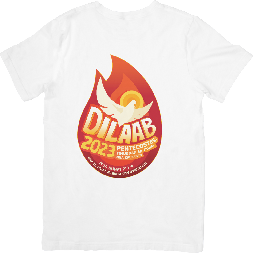
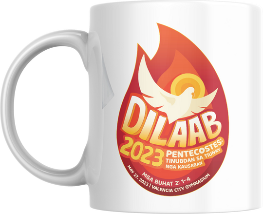
publication material
raw photo

Raw to Refined : The art of transformation
raw photo
This before-and-after example demonstrates my approach to incorporating clean, modern design elements, I aim to create visually appealing marketing assets that clearly communicate the product’s appeal.
publication material
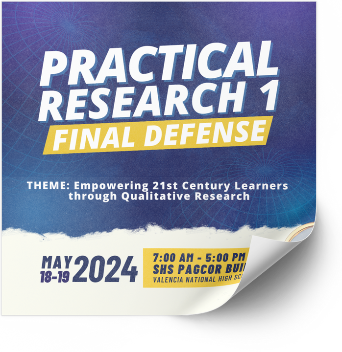
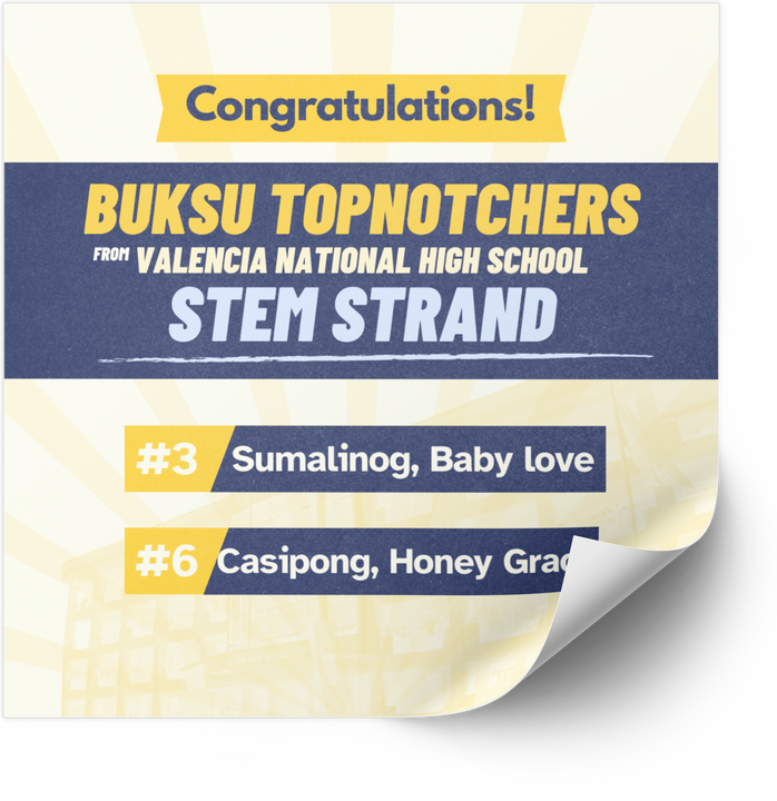
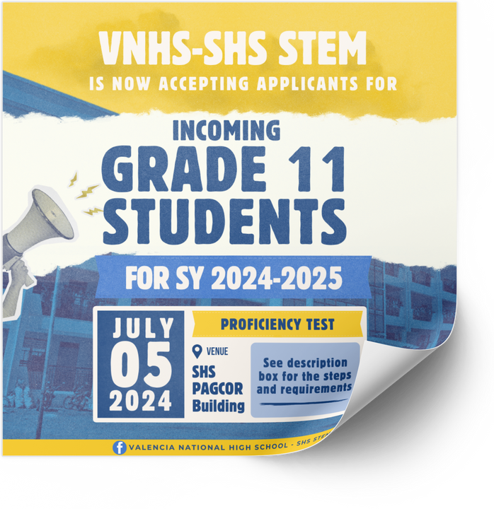
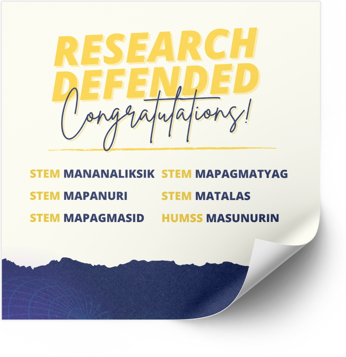
Infographic: the way to effective communication
These infographics for various school events had gone through a process that combines creativity and clear communication. Key details are organized into an easy-to-follow layout that captures attention and conveys the purpose to become an attractive and informative tool that boosts event awareness and participation.
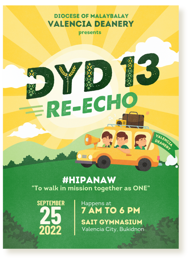
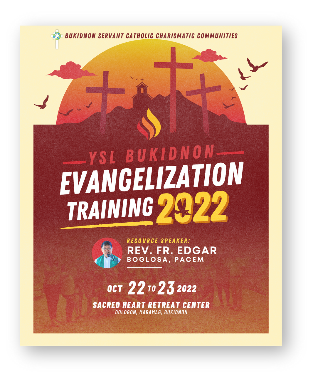
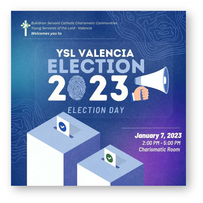
These event posters are made to address the needs of event. Each is designed according to its purpose and objective.
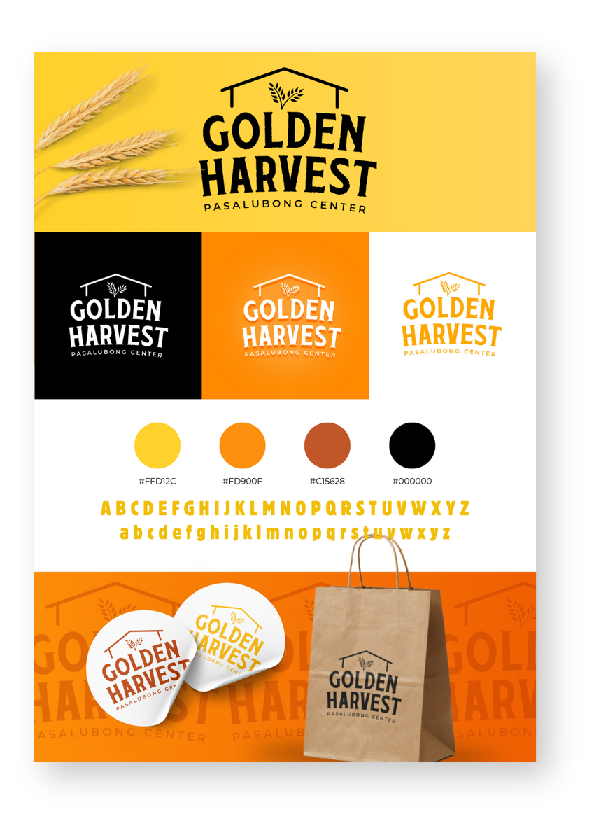
Crafting Identity
The creative process of making this logo and brand board combines artistic vision with strategic thinking. It starts with understanding the brand’s identity and values, then translating them into visual elements like colors, fonts, and symbols.
The use of blue and green hues conveys trust, growth, and a focus on scientific and environmental themes, aligning with the center's values and objectives.
Microscope
The microscope represents scientific research and discovery, symbolizing the center's commitment to advancing knowledge through empirical study.
Greek Columns
The Greek columns symbolize strength, stability, and a foundation of knowledge, representing the enduring support the center provides to the school community.
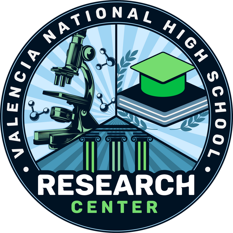
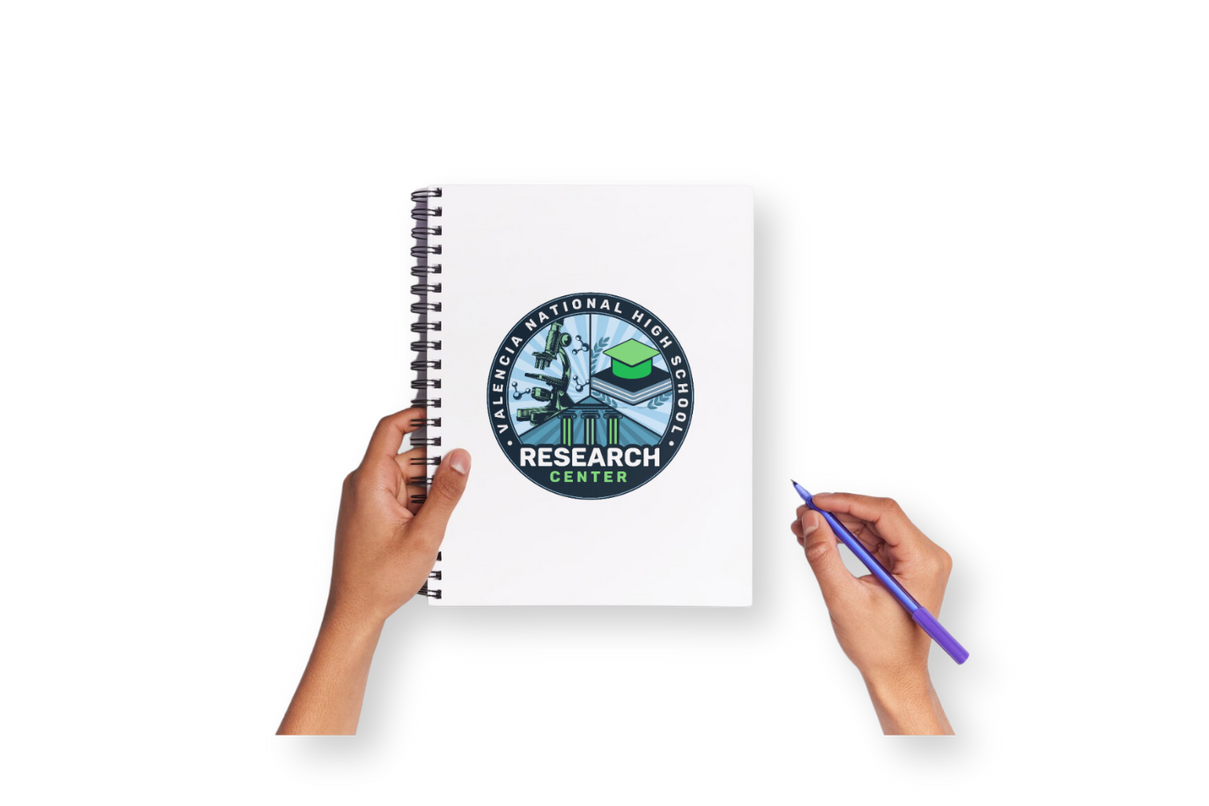
insitutional logo
This sample logo was created in collaboration with the school's research team.
Circular Shape
The circular design of the logo signifies unity and inclusiveness, reflecting the center's aim to bring together students, educators, and researchers in a collaborative environment.
Graduation Cap on Books
The graduation cap atop a stack of books embodies education and academic achievement, reflecting the center's role in supporting students' educational growth and success.
Radiating Lines
The radiating lines in the background suggest enlightenment and the spread of knowledge, indicating the center's mission to disseminate information and inspire intellectual curiosity.

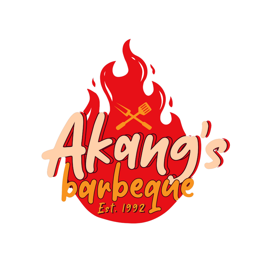
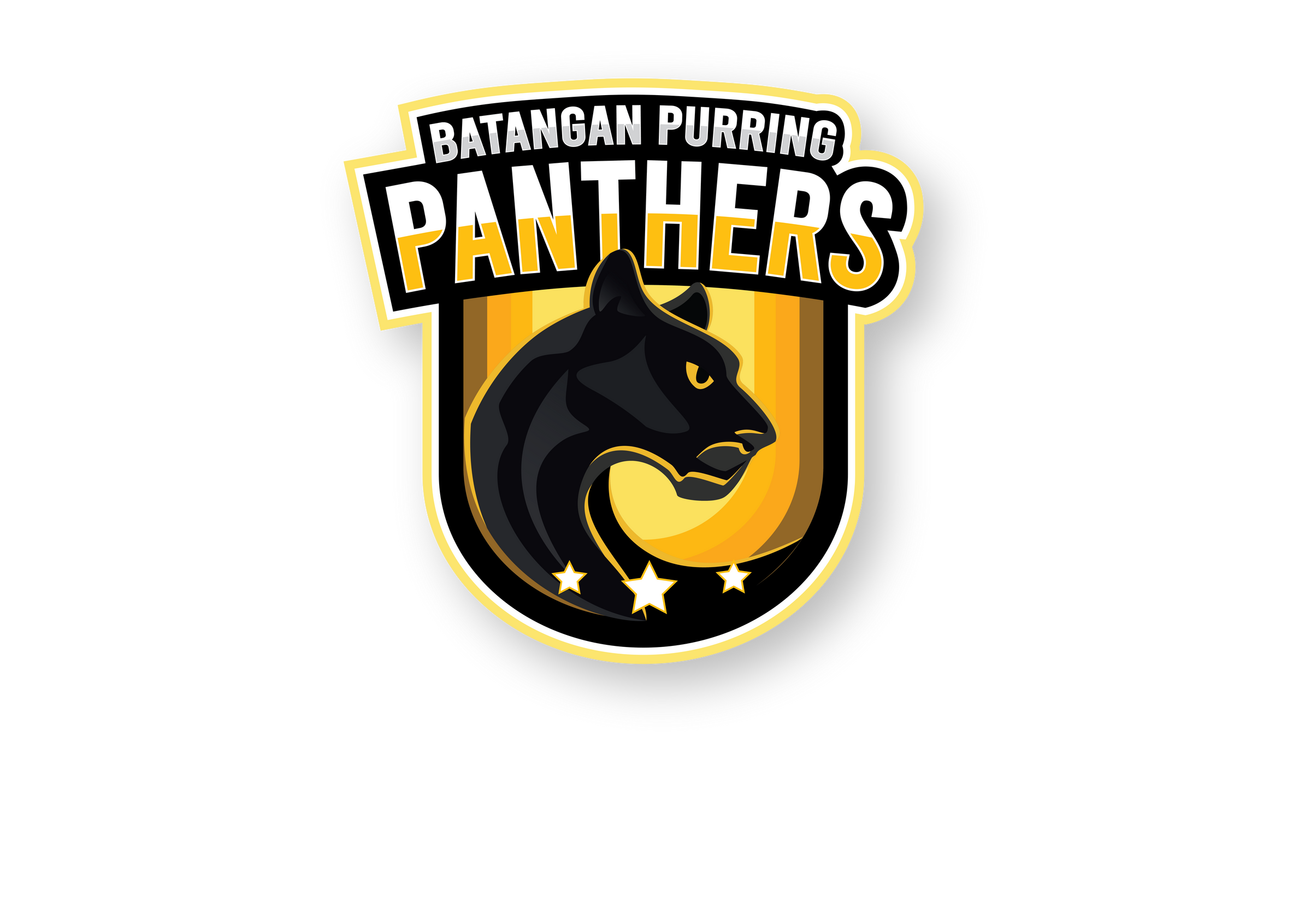
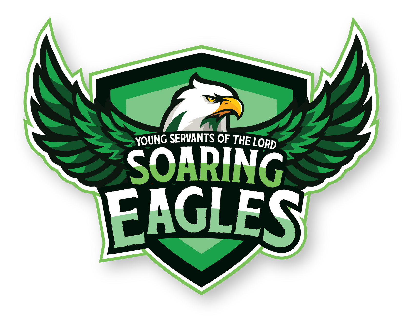
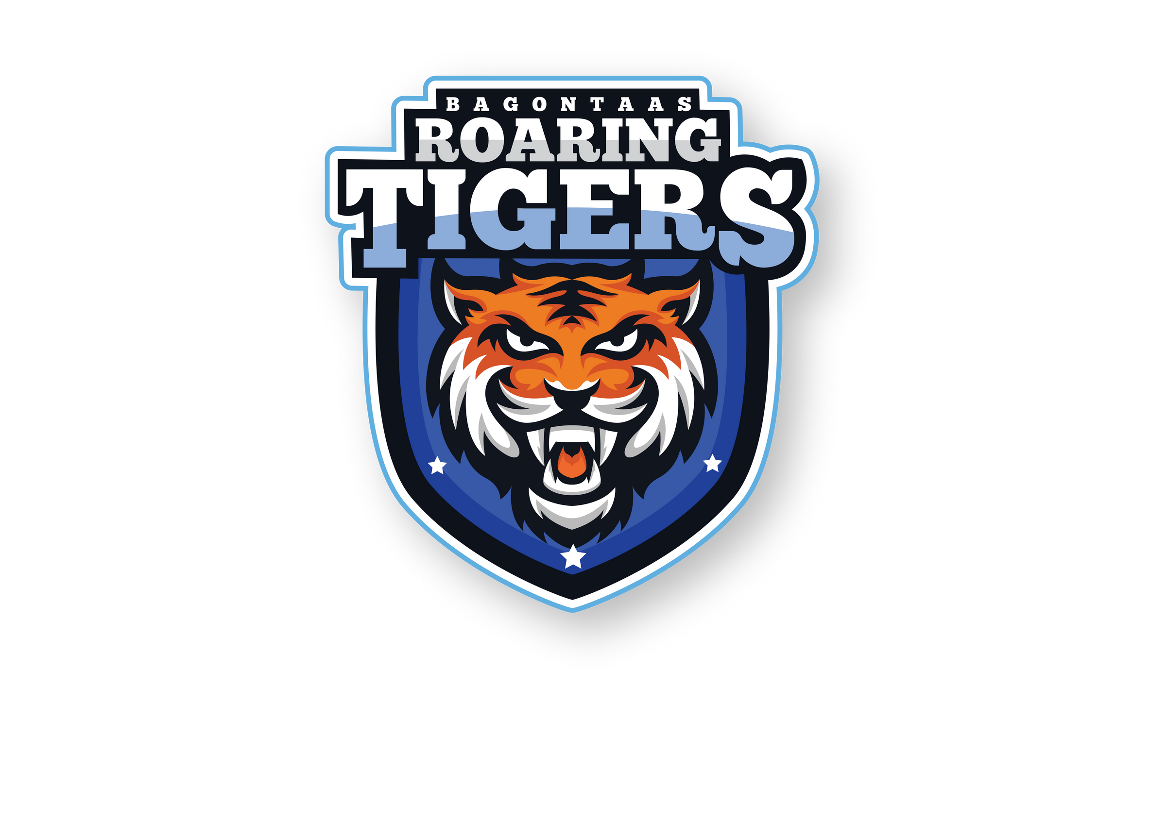
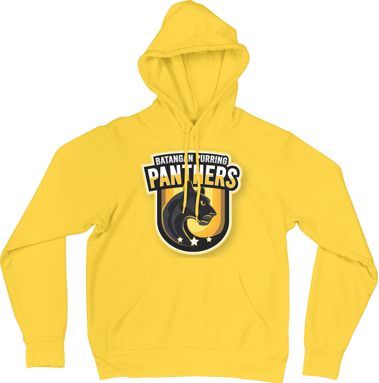
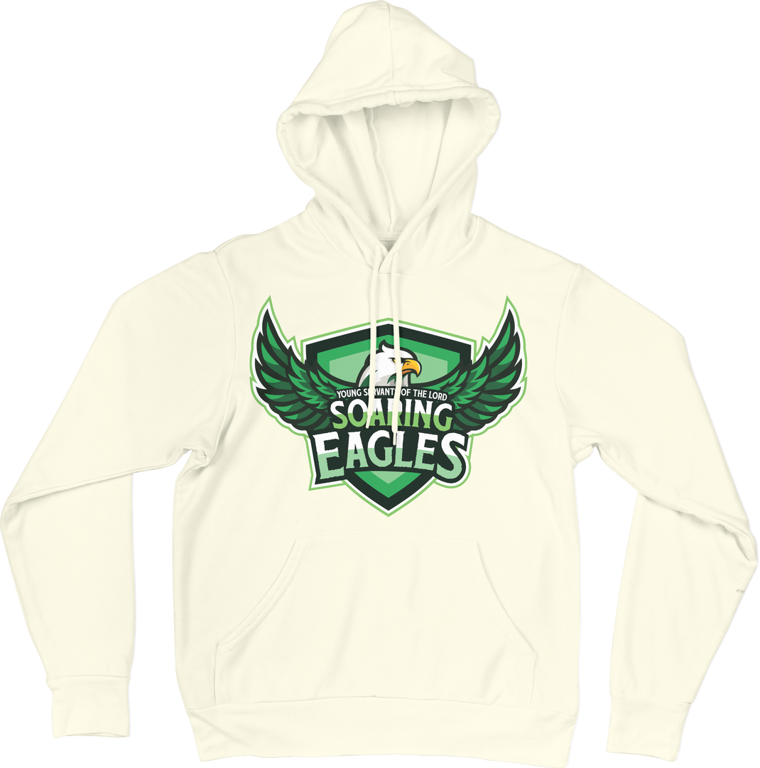
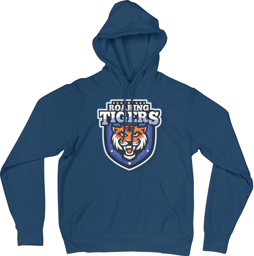
team sports logo
Designing a team sports logo requires understanding the team's identity with visual symbolism. It involves choosing colors, typography, and imagery that evoke pride and unity, refining the design through feedback, and ultimately creating a powerful emblem that represents the team’s spirit and values.
Print Magic: The Art of Tangible Design
This print design started with brainstorming and sketching, followed by selecting colors, fonts, and imagery that convey the desired message. Each element is carefully arranged and refined to achieve a harmonious and impactful composition.